Why Font Choice Matters for Cover Letters
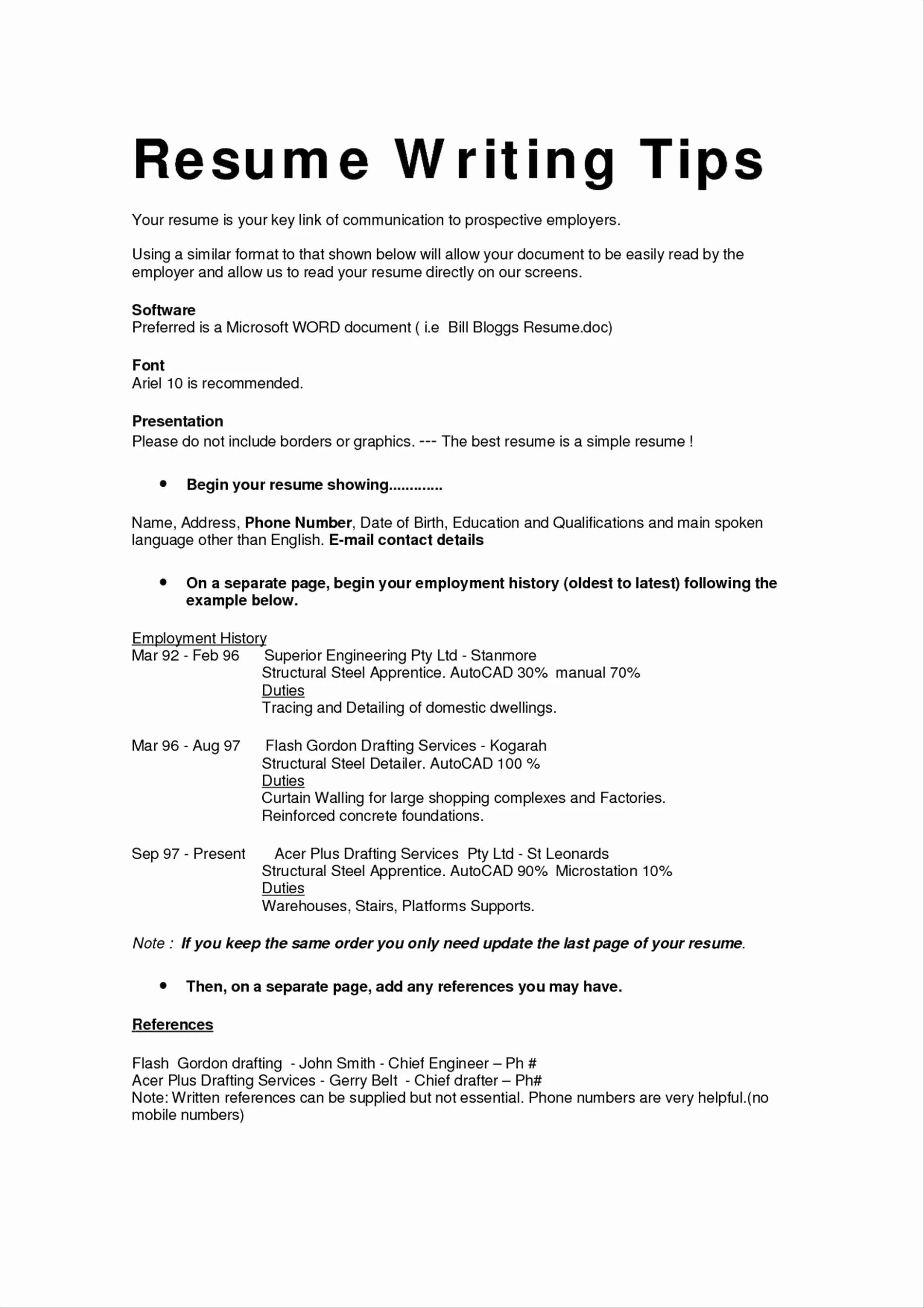
In the competitive world of job applications, every detail counts. Your cover letter is your first impression, and just like a firm handshake or a professional appearance, the font you choose can significantly impact how you’re perceived. The right font makes your cover letter easy to read, projects professionalism, and demonstrates attention to detail. Choosing the right font can make the difference between getting your resume read or ending up in the rejection pile. A well-chosen font makes a positive first impression, showcasing your professionalism and attention to detail, while an inappropriate font can detract from your qualifications and even send the wrong message.
The Importance of Readability
Readability is paramount. Recruiters and hiring managers often have to review hundreds of applications, and their time is limited. If your cover letter is difficult to read, it’s unlikely they will spend the time needed to decipher its contents. Fonts that are too ornate, small, or closely spaced can strain the reader’s eyes and make it difficult to quickly grasp the information. Your primary goal is to make it easy for the reader to absorb your qualifications and understand why you are the perfect fit for the job. A font that is clear and easy to read ensures your message is conveyed effectively, capturing their attention and encouraging them to delve deeper into your skills and experience.
Impact of Font on Professionalism
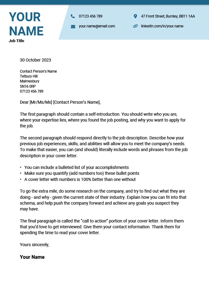
The font you choose reflects your personality and professionalism. A cover letter written in a serious, easily readable font conveys that you are a professional who is serious about the opportunity. Certain fonts are associated with particular impressions; for example, overly playful or unconventional fonts can give the impression that you lack seriousness or attention to detail. The goal is to project confidence and professionalism to create a positive first impression. The correct font choice establishes an instant rapport with the reader, helping them understand your value from the first word to the last.
Top 5 Cover Letter Font Choices
Arial
Arial is a widely-used sans-serif font, which means it doesn’t have the small strokes at the end of each letter. Its clean and simple design makes it highly readable. Arial is a safe and reliable choice that works well in various contexts, including cover letters. It is a good option because of its neutral appearance, ensuring the focus remains on the content of your cover letter rather than the font itself. Arial is generally perceived as modern and straightforward, which fits well with most professional settings.
Why Arial is a Good Choice
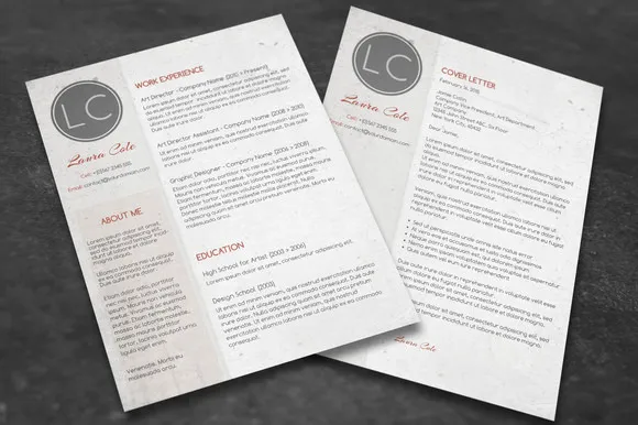
Arial’s popularity means it’s universally available and displays consistently across different devices and operating systems. This is especially important for cover letters, which can be opened on various platforms. Its clear and simple design ensures that your letter looks polished and professional. The readability is a key advantage, allowing the hiring manager to quickly scan through the information. The straightforwardness and the design ensures the reader’s focus is placed on your qualifications and experiences, not the font.
Arial pros and cons
- Pros: Highly readable, widely available, and projects a modern, clean look
- Cons: Very common, so it may not help your cover letter stand out, and the lack of serifs might be seen as less traditional.
Times New Roman
Times New Roman is a classic serif font, which means it has small decorative strokes at the end of each letter. It is a traditional and safe choice, often associated with academia and formal documents. Times New Roman’s classic appearance conveys a sense of formality and is generally well-received in professional contexts. Its familiarity helps create a sense of trustworthiness. It is a good choice if you want to project a sense of classic professionalism.
Why Times New Roman is a Good Choice
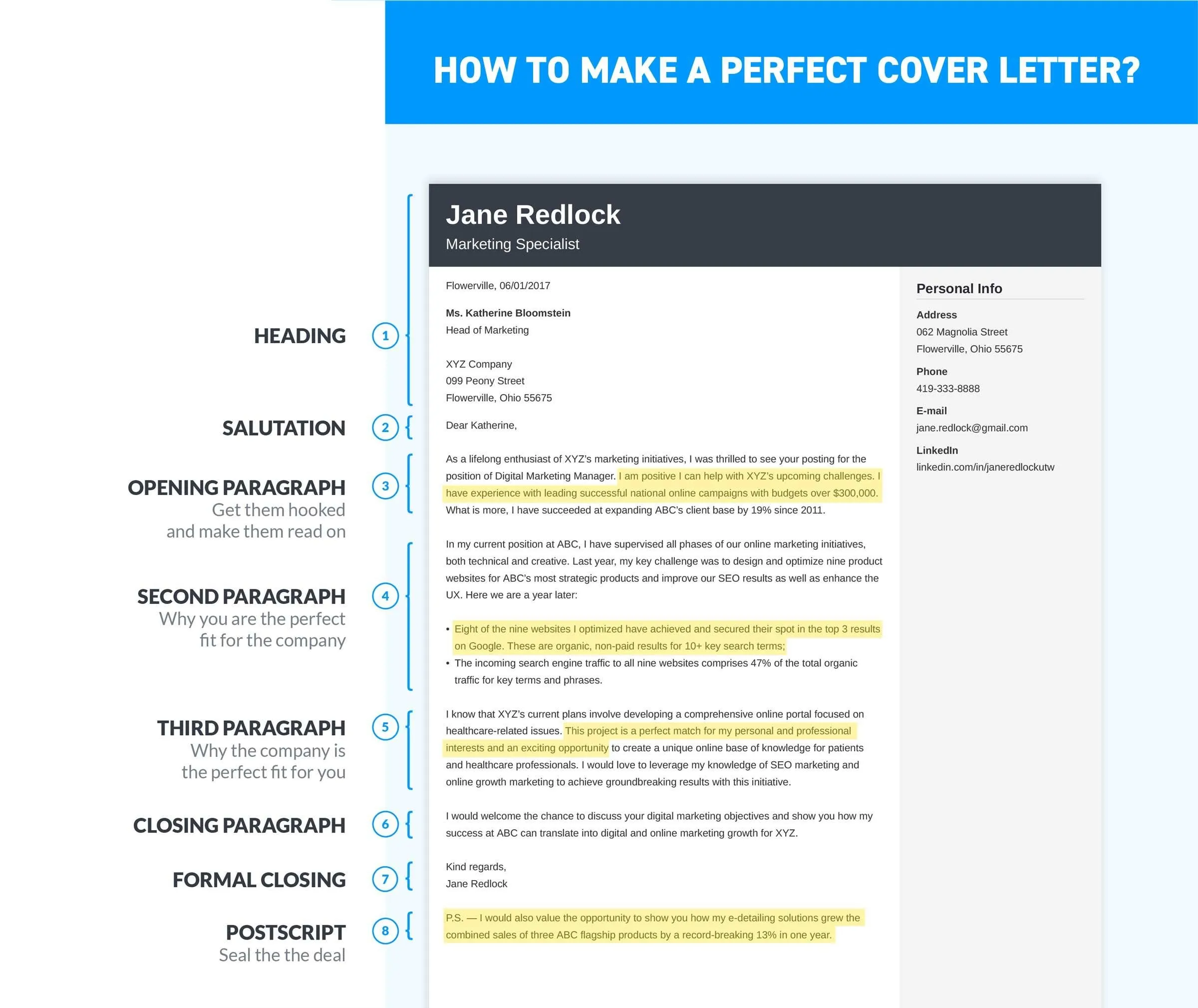
Times New Roman’s familiarity makes it easily readable, even for those who are not used to reading long documents. Its traditional appearance is suitable for industries that value formality. This is a versatile font that works well for various cover letter styles and professional settings. The font choice shows that you are professional and take your application seriously. It is a good option if you want to project a sense of classic professionalism.
Times New Roman pros and cons
- Pros: Classic and widely recognized, conveying a sense of professionalism and formality
- Cons: Can appear dated in some modern contexts, and the serifs might not be as readable on all screens.
Calibri
Calibri is a sans-serif font and is a common default font in many word processing programs, making it widely accessible. It’s a modern and clean font that is easy on the eyes, making it a good choice for readability. Its slightly rounded design gives it a friendly yet professional look, which can be advantageous in creating a positive first impression. Calibri is known for its clarity, and its subtle style is ideal for professional correspondence.
Why Calibri is a Good Choice
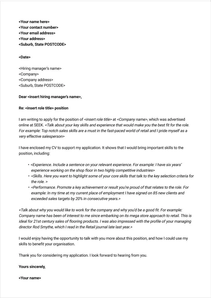
Calibri is designed for readability, making it easy to read on-screen and in print. It offers a clean and modern aesthetic that conveys professionalism without appearing overly formal. Its widespread use means you can be confident that your cover letter will display correctly, regardless of the recipient’s device. The font is very clear and easy to read. It is a good choice for those aiming to project a modern and approachable image.
Calibri pros and cons
- Pros: Modern, readable, and widely available
- Cons: Can appear too common, potentially making it less memorable, and slightly less formal than Times New Roman.
Garamond
Garamond is a serif font known for its elegance and readability, even at smaller sizes. Its classic design lends a touch of sophistication to your cover letter, helping it stand out. Garamond strikes a balance between formality and style. This font is a good option for those wanting to give their cover letter a timeless, professional feel. This font will leave a lasting impression.
Why Garamond is a Good Choice
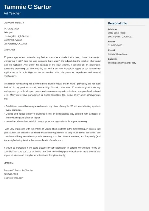
Garamond’s refined appearance adds a touch of sophistication, while its excellent readability ensures your content is easily absorbed. This is a great choice because it works well in both digital and print formats. Garamond’s ability to maintain clarity at smaller sizes is also an advantage. If you are looking to convey a sense of sophistication, then this is the font for you. The font looks amazing in all formats.
Garamond pros and cons
- Pros: Elegant and highly readable, projecting a sophisticated and professional image
- Cons: May appear less modern than other fonts and might not be the best choice for all industries
Helvetica
Helvetica is a widely-used sans-serif font known for its clean, neutral appearance and excellent readability. It’s a versatile choice that works well in almost any professional setting. Its simplicity conveys professionalism and approachability. It is a solid option because of its clarity and it projects a modern feel.
Why Helvetica is a Good Choice
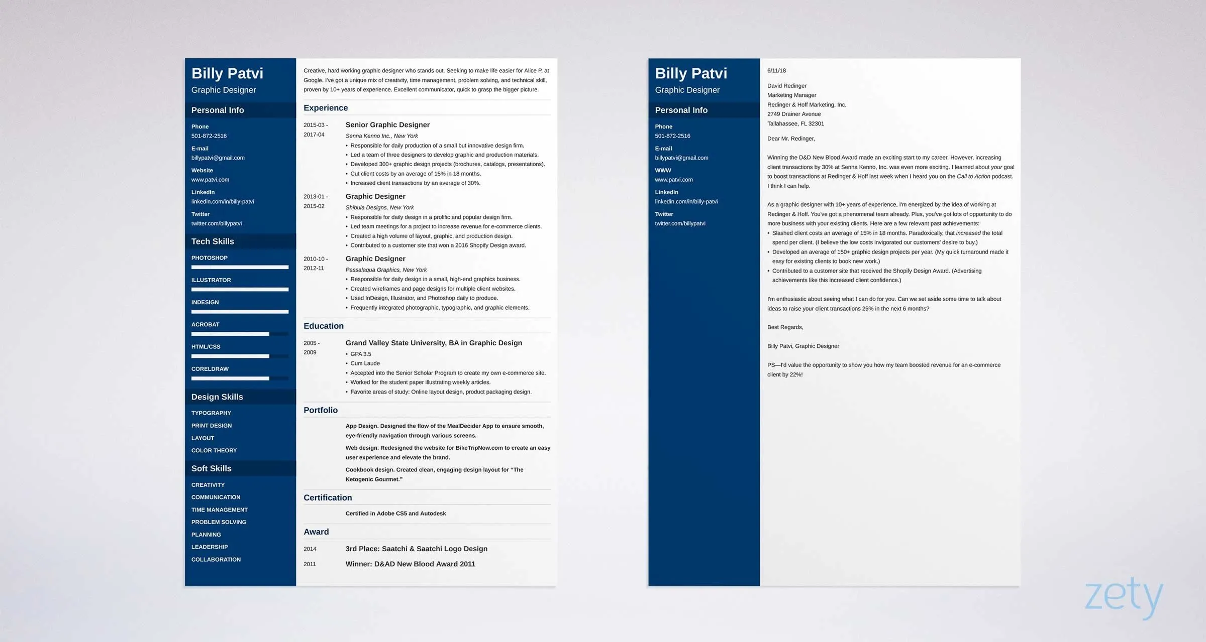
Helvetica’s clarity makes it easy to read, and its neutral appearance ensures that the focus remains on the content of your cover letter. It is ideal for those who prefer a clean, modern, and straightforward design. Its broad availability ensures that it renders consistently across different platforms. The font can be understood easily and gives your cover letter a sleek professional appearance.
Helvetica pros and cons
- Pros: Clean, highly readable, and widely recognized, offering a neutral and professional aesthetic
- Cons: Can appear somewhat generic, potentially making it less memorable, and its simplicity may not be ideal for all industries.
Tips for Cover Letter Font Selection
Font Size and Spacing
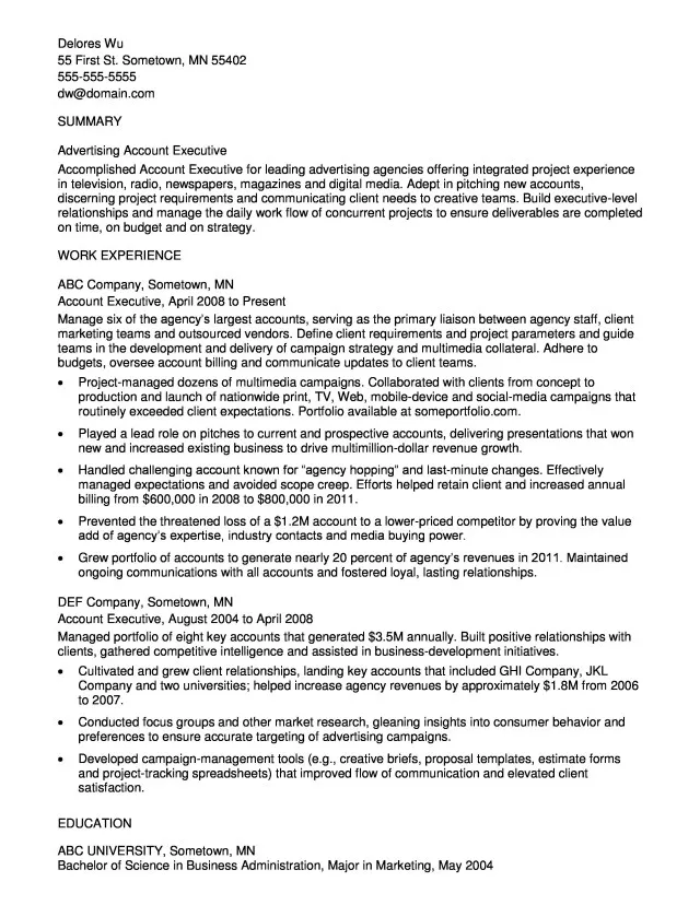
While font choice is important, adjusting the font size and spacing can significantly enhance readability. Use a font size between 10 and 12 points to make your cover letter easy to read without appearing too large or too small. Proper line spacing, usually 1.15 or 1.5, helps to prevent your text from looking cramped. This makes your document more inviting and readable.
Consistency is Key
Maintain consistency throughout your cover letter. Avoid switching between multiple fonts or font styles, as this can make your document look unprofessional. Choose one font and stick with it, using variations like bold or italics sparingly for emphasis. Maintaining a consistent font style ensures a polished and professional look, presenting you as organized and detail-oriented.
Testing Your Cover Letter
Before sending your cover letter, always review it on different devices and in different formats. This helps ensure that the font renders correctly and is easy to read on various platforms. Print a copy to check how it looks on paper, as the appearance on screen can differ from print. Proofread carefully to catch any errors in spelling or formatting that may have occurred. This helps to project professionalism and ensure your message is conveyed clearly.
Conclusion
Choosing the right font for your cover letter is more than just an aesthetic decision; it is a strategic one. By prioritizing readability, professionalism, and consistency, you can make a positive first impression and increase your chances of getting noticed. Consider the options discussed in this article and select a font that aligns with your personal brand and the specific industry or role you are applying for. The correct font choice can greatly increase your chances of getting hired.
