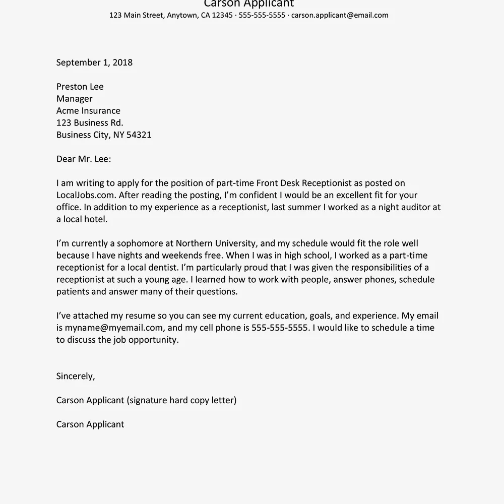
Why Font Choice Matters for Resumes and Cover Letters
In the competitive world of job applications, every detail counts. From the content of your resume and cover letter to their overall design, each element contributes to the impression you make on a potential employer. One often-overlooked aspect that significantly influences this impression is your font choice. Selecting the right font isn’t merely an aesthetic decision; it’s a strategic one that impacts how your application is perceived, how easy it is to read, and ultimately, your chances of landing an interview. The font you choose can subtly communicate professionalism, attention to detail, and your understanding of modern design principles. Choosing the wrong font can inadvertently send the wrong message, potentially hindering your chances before the recruiter even reads your qualifications. So, let’s dive into the importance of font selection and how it can work in your favor.
Impact on First Impression
Your resume and cover letter are the first point of contact with a potential employer, making a strong first impression crucial. The font you select immediately shapes this impression. A well-chosen font conveys professionalism, competence, and an understanding of design principles. It signals that you’ve taken the time to consider the details, which reflects positively on your overall attention to detail. Conversely, a poorly chosen font can inadvertently communicate a lack of care or attention. Overly ornate or unconventional fonts might appear unprofessional or even distracting, potentially leading the recruiter to form a negative initial judgment. First impressions are lasting, so making sure your font choice sets the right tone is vital for capturing the reader’s attention and encouraging them to delve deeper into your qualifications. The font, along with layout and formatting, should make you look like a thoughtful professional.
Readability and Professionalism
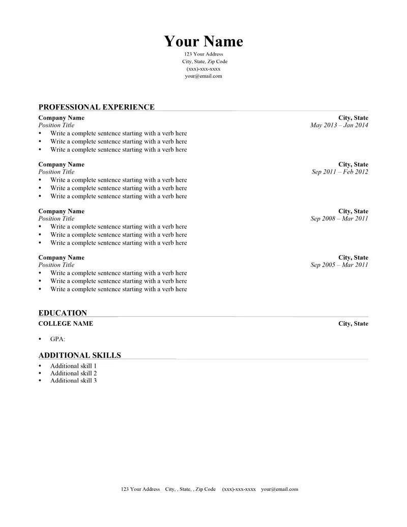
Beyond first impressions, font choice significantly impacts readability. A font that is easy to read ensures that your qualifications and experience are easily accessible to the hiring manager. If the font is difficult to read, it can frustrate the reader, leading them to lose interest or skim over important details. Fonts like Arial, Helvetica, and Calibri are generally considered highly readable, thanks to their clear letterforms and consistent spacing. They are designed for ease of reading, which is essential for documents like resumes and cover letters, where clarity is paramount. Professionalism is also conveyed through font choice. Choosing fonts that are widely accepted and considered professional, like the ones listed above, communicates that you understand workplace norms and can present yourself effectively. Fonts like Comic Sans or Curlz, while visually distinct, are generally seen as unprofessional for serious applications, potentially undermining your credibility.
Top 5 Fonts for Resumes and Cover Letters
Selecting the right font is crucial for making a positive impression and ensuring your resume and cover letter are easy to read. Here’s a look at five fonts that are widely recommended and suitable for professional applications.
Arial
Arial is a sans-serif font known for its clean and straightforward appearance. It’s a popular choice because of its simplicity and high readability. Its clear letterforms make it easy to read on both paper and screen, which is crucial given that many resumes are viewed digitally. Arial conveys a sense of professionalism without being overly formal, making it suitable for various industries. The font’s familiarity is also an advantage, as most readers find it comfortable and unobtrusive. Arial is a versatile choice that works well for both the body text and headings, offering a cohesive and professional look. Its balanced design ensures that your resume or cover letter is accessible and visually appealing, helping to highlight your qualifications.
Why Choose Arial?
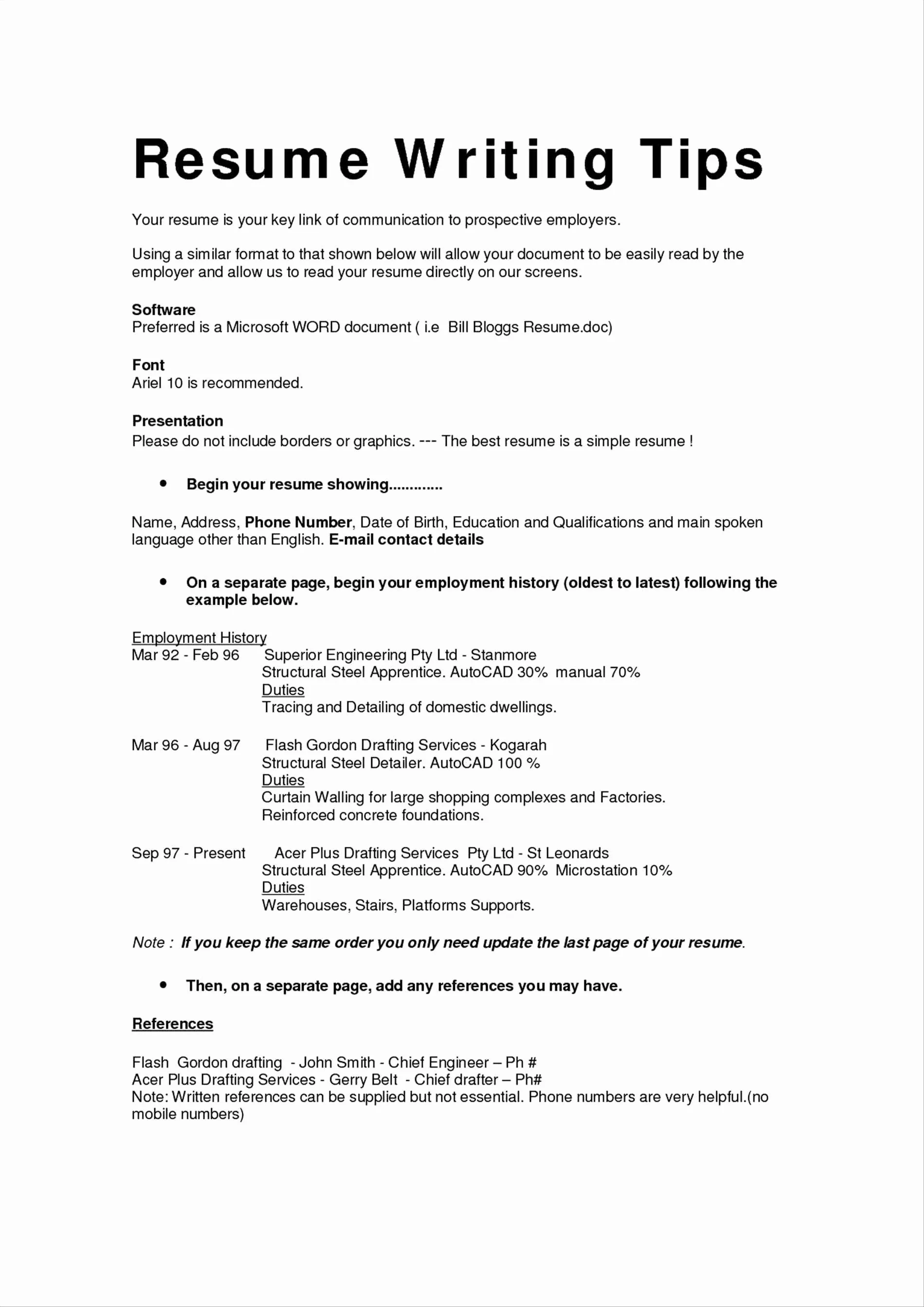
Choosing Arial provides a classic, dependable look that is universally understood. It is a safe choice that ensures your resume and cover letter are easy to read and presents a professional image. Its wide availability on various operating systems also makes it a practical choice. Recruiters and hiring managers are likely to encounter it frequently, and as such, it doesn’t draw unnecessary attention to the font itself. Instead, it allows your qualifications to take center stage. If you’re aiming for a clean, modern appearance that prioritizes readability, Arial is an excellent choice.
Helvetica
Helvetica is another widely-used sans-serif font renowned for its clarity and versatility. It’s known for its clean lines and balanced proportions, making it exceptionally readable. Helvetica exudes a modern and sophisticated feel, making it a popular choice among professionals. This font is also highly adaptable, working well across a variety of applications, from resumes to cover letters and beyond. Its straightforwardness ensures that the focus remains on your content rather than the font itself. Its widespread use across industries also means that it is familiar to most readers, enhancing readability and conveying a professional image. Helvetica’s elegant simplicity is a great choice for individuals who want a crisp and contemporary aesthetic.
Why Choose Helvetica?
Helvetica is preferred for its contemporary, yet professional appearance. It is highly legible, and its neutral design ensures it will work well across different industries and roles. Choosing Helvetica suggests you have a sense of design and understand how to present your professional brand effectively. Furthermore, Helvetica is a great choice if you want your application to convey a sense of modernity and professionalism, ensuring that your qualifications are presented clearly and elegantly.
Times New Roman
Times New Roman is a serif font that has been a staple in professional documents for decades. Its traditional design offers a sense of formality and reliability, which can be beneficial depending on the industry and the company’s culture. Its serif design assists in readability, especially in dense blocks of text, guiding the eye smoothly across the page. This font is particularly suited to individuals aiming to portray a traditional and established image. Its classic appeal resonates well with conservative industries such as law, finance, and academia. Times New Roman demonstrates a respect for conventions while still maintaining a clear and professional appearance.
Why Choose Times New Roman?
Times New Roman offers a sense of formality and tradition that is ideal if you’re applying to an organization with a more conservative culture. Its classic design is widely recognized and ensures your document looks professional and reliable. Its clear serifs and structured letterforms facilitate easy reading, making it especially suitable for lengthy documents. Choosing Times New Roman can also signal a respect for established norms, suggesting you are a candidate who pays attention to detail and understands workplace expectations.
Garamond
Garamond is another elegant serif font, recognized for its classic and refined appearance. Its slightly more stylized letterforms offer a sophisticated and professional look without appearing overly rigid. Garamond is known for its exceptional readability, making it suitable for lengthy documents and ideal for emphasizing a refined aesthetic. The font’s softer, more flowing lines can lend a touch of personality and warmth to your resume or cover letter, making it stand out in a subtle way. It conveys a sense of sophistication and attention to detail, suitable for candidates aiming to highlight a blend of classic style and modern awareness. If you aim for a balance of style and readability, Garamond might be the right choice.
Why Choose Garamond?
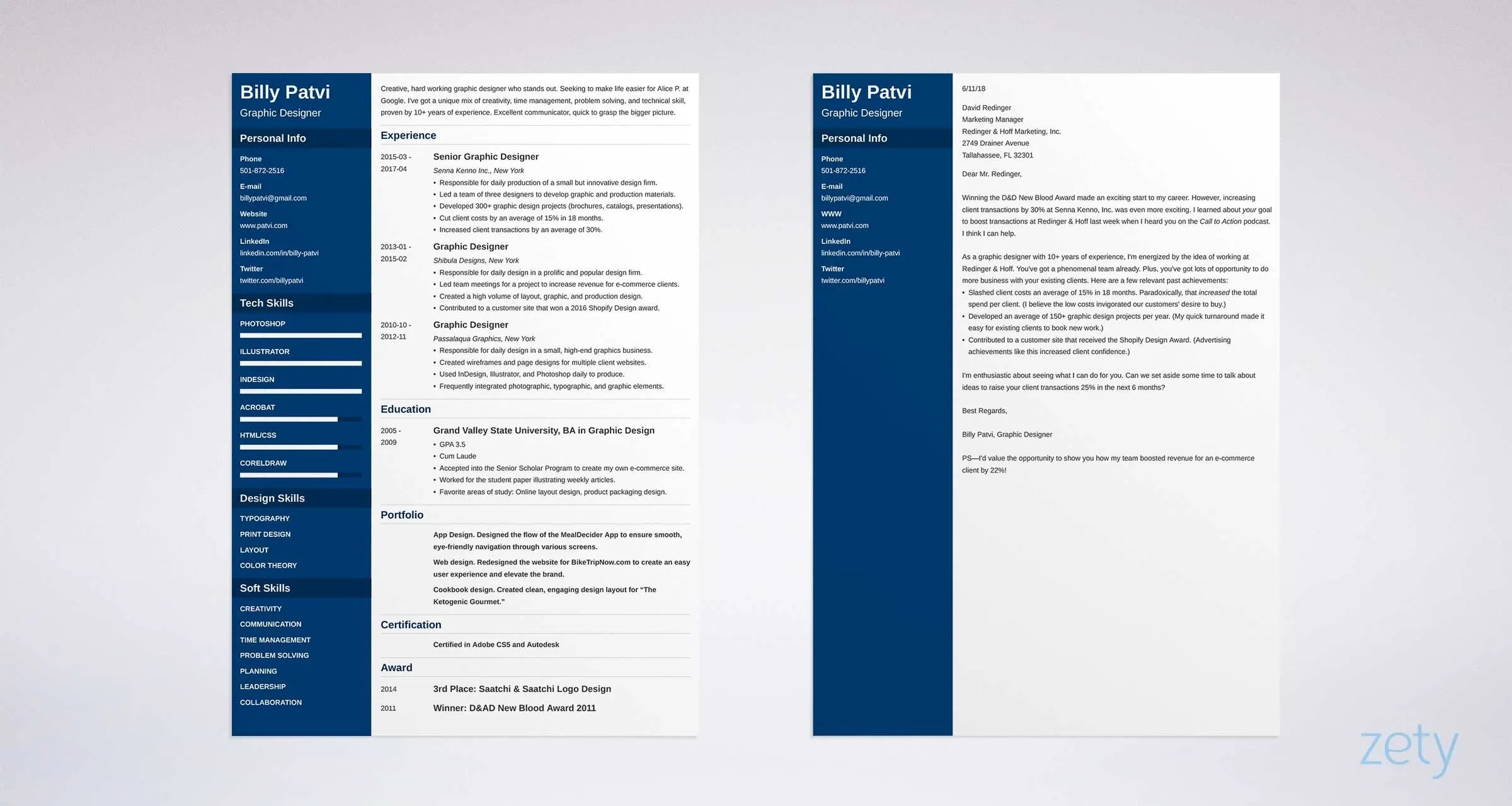
Garamond is an excellent choice for those seeking a professional and refined aesthetic. Its classic style conveys sophistication and a subtle sense of artistry. It’s a great font for anyone wanting to project a sense of sophistication and professionalism. It’s also highly readable, making it ideal for documents where the content must be easy to digest. Its softer lines give the font a touch of personality, making your application memorable in a tasteful way. Garamond is best for anyone looking to elevate their application’s visual appeal.
Calibri
Calibri is a modern sans-serif font that is now a standard choice for many professional documents. It is known for its clear and approachable design, which enhances readability on both screen and paper. The font’s rounded letterforms and balanced proportions offer a clean, contemporary look, well-suited for various industries. Calibri is a versatile choice that conveys professionalism without being overly formal. This font is easy on the eyes and works well for both body text and headings, ensuring a cohesive and professional presentation. Its widespread usage across different platforms also makes it easy to access and universally recognized. Choosing Calibri indicates an understanding of modern standards while focusing on clarity.
Why Choose Calibri?
Calibri is a safe and reliable option. It offers a modern and clean look that is easy to read and widely recognized. If you want a contemporary feel and want to ensure your content is accessible and easy to read, Calibri is a solid choice. Calibri is a great option if you want a professional look. It’s a font that conveys professionalism, with an easy-to-read style that suits a wide array of application needs. It is the right choice for those wanting a modern and clean presentation.
Tips for Choosing the Right Font
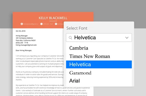
Selecting the perfect font for your resume and cover letter is a crucial aspect of creating a professional and appealing document. It’s about more than just personal preference; it’s about aligning your application with industry standards and making it as easy as possible for recruiters to read and appreciate your qualifications. Here’s some guidance on selecting the right font to ensure your job applications are impactful.
Consider Your Industry
The industry you’re applying to plays a vital role in font selection. Some fields have established norms. For example, more conservative industries such as law or finance often favor traditional serif fonts like Times New Roman, which communicates a sense of formality and reliability. In contrast, creative industries, such as marketing or design, might embrace modern sans-serif fonts like Helvetica or Arial to project a contemporary image. It is critical to research the industry standards and the tone of the companies you are applying to. If a company’s website or branding uses specific fonts, consider mirroring that in your application to demonstrate your attention to detail and understanding of their culture. Always aim to align your font choice with the expectations of the industry to create a better fit.
Prioritize Readability
Readability is paramount. The primary goal of your resume and cover letter is to effectively communicate your qualifications. If the font is difficult to read, the recruiter may quickly lose interest. Choose fonts that are clear, well-spaced, and easy on the eyes. Sans-serif fonts like Arial and Calibri are generally excellent choices for their simplicity and modern look. Serif fonts like Times New Roman and Garamond can also work well, especially if the text is formatted in a clear and organized manner. Avoid overly ornate or unconventional fonts, such as script or highly stylized fonts, as they can be hard to read and detract from your content. Regardless of the font style, ensure a comfortable font size, typically between 10 and 12 points, to enhance readability. Always consider how the font appears on a screen and in print. This will help ensure your qualifications are easily accessible to the hiring team.
Maintain Consistency
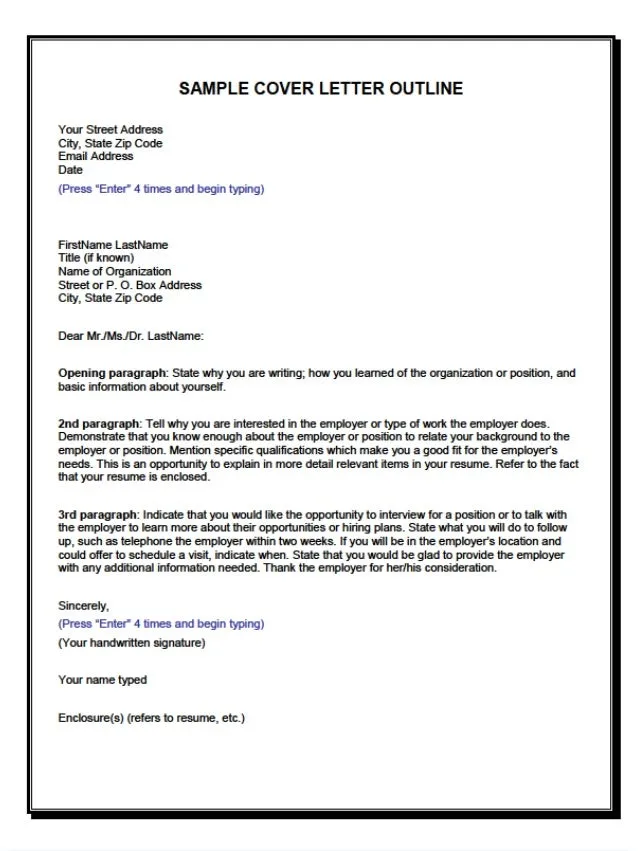
Consistency is key to a polished and professional-looking document. Select one font for your body text and another for headings, or stick to a single font throughout. Mixing too many fonts can appear cluttered and unprofessional. Ensure consistent font sizes, styles (such as bold or italics), and spacing throughout your resume and cover letter. If you choose different fonts for headings and body text, make sure they complement each other. Avoid using fonts that clash or are of similar appearance, as this can create confusion and detract from the overall design. Consistency shows that you have considered the layout and presentation of your application. This attention to detail is crucial for making a positive impression.
Testing and Previewing Your Documents
Before submitting your resume and cover letter, always preview them in various formats to ensure they appear as intended. Consider how the document looks when printed and on different devices, as fonts can render differently across various platforms. View your documents on various devices such as laptops, tablets, and smartphones. These documents may be viewed in a variety of situations by the potential employer. Make sure that your font choice maintains its legibility and visual appeal. Always proofread for any formatting errors or inconsistencies before submitting your application. Request feedback from friends, family, or career advisors. They will provide a fresh perspective on your presentation.
